

What Is Market Structure in Trading? A Practical Guide for Indian Traders
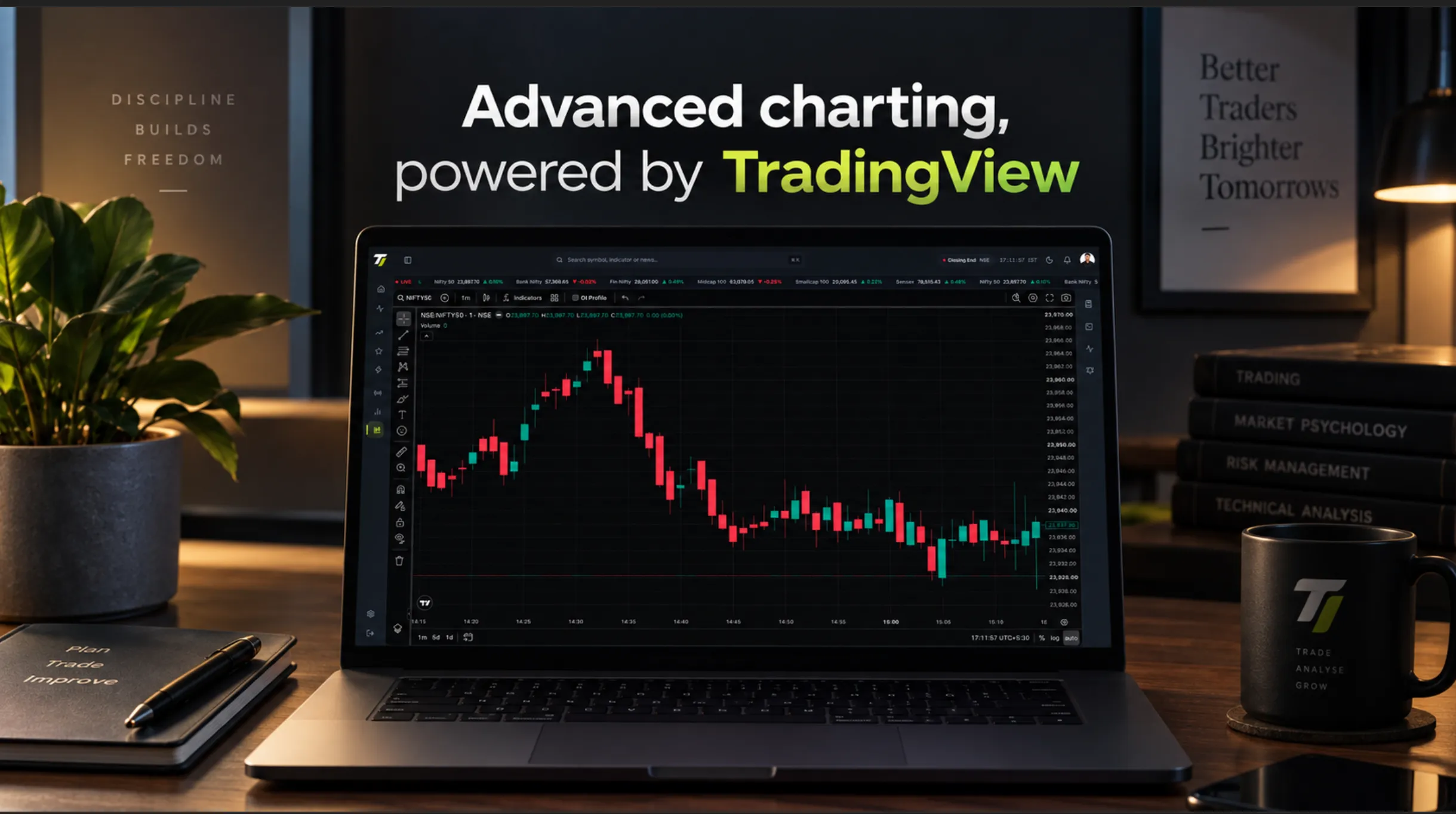
Look at any trading chart for long enough and you'll notice something: price doesn't move in a straight line.
It moves up, pulls back, tries again, sometimes breaks higher, sometimes fails, and sometimes reverses completely.
That sequence of highs and lows is what traders commonly call market structure.
And before getting buried under indicators, alerts and complicated strategies, understanding that structure is one of the simplest ways to make sense of a chart.
NSE's technical-analysis education also treats market structure, swings and trends as important parts of technical analysis.
So, What Is Market Structure?
At its simplest, market structure is about comparing significant highs and lows.
In an upward-moving market, you might see:
Higher High → Higher Low → Higher High → Higher Low
In a downward-moving market:
Lower Low → Lower High → Lower Low → Lower High
That's the basic idea.
If buyers are consistently pushing price to new highs while pullbacks hold above previous lows, the market is showing bullish structure.
If sellers keep pushing price to new lows while rallies fail below previous highs, the structure is bearish.
Simple enough.
But there's a catch: not every high and low matters.
A five-minute chart can contain dozens of small swings. Mark every single one and your chart quickly becomes a Jackson Pollock painting.
The goal is to identify the swings that actually matter in the timeframe you're analysing.
A Pullback Doesn't Mean the Trend Has Reversed
This is where market structure becomes genuinely useful.
Imagine NIFTY is moving higher and has formed:
HH → HL → HH
Then price starts falling.
The candles turn red. Momentum slows down. It looks bearish.
But has the structure actually changed?
Not necessarily.
If price pulls back but holds above an important previous low, the broader bullish structure may still be intact.
This distinction between a pullback and a reversal is important, especially for intraday traders.
Instead of reacting to the latest candle, you're looking at the bigger sequence.
What Are BOS and CHoCH?
If you've explored Smart Money Concepts, you've probably come across two terms: BOS and CHoCH.
BOS ( Break of Structure ) is commonly used when price breaks an important structural high or low in the direction of the existing trend.
CHoCH ( Change of Character ) is commonly used when price breaks a significant part of the existing structure, suggesting that market behaviour may be changing.
For example:
Bullish structure:
HH → HL → HH
If price breaks above the previous significant high, traders may call it a bullish BOS.
If instead price breaks below an important higher low, traders may interpret that as a potential CHoCH.
But here's something worth remembering:
BOS and CHoCH aren't universally standardized exchange indicators.
Different traders and platforms can use different rules to identify significant swings and structural breaks.
So the label itself isn't the important part.
The important part is understanding what price actually broke and why that level matters.
Why Timeframe Matters
A market can look bullish on one timeframe and bearish on another.
Imagine NIFTY is in a broader uptrend on the daily chart.
During today's session, the five-minute chart starts making lower highs and lower lows.
Is NIFTY bullish or bearish?
The honest answer is:
It depends on the timeframe.
The five-minute movement could simply be a pullback inside the larger daily trend.
This is why looking at market structure across multiple timeframes can provide useful context.
Start with the bigger picture.
Then zoom in.
Market Structure Isn't a Buy or Sell Signal
This is probably the most important point.
A bullish structure doesn't automatically mean buy.
A bearish structure doesn't automatically mean sell.
Market structure describes what price is doing. It doesn't guarantee what price will do next.
A trader still needs to consider:
- Current market conditions
- Important price levels
- Volatility
- Risk
- Trade invalidation
- Higher-timeframe context
Think of market structure as a map, not a GPS that knows the future.
Where Tradelimo Fits In
This is where charting technology can make the process easier.
When you're watching NIFTY, Bank NIFTY, equities or multiple timeframes, manually tracking every significant swing can become tedious.
Tradelimo is designed to visualize market-structure concepts directly on the chart, including BOS, CHoCH, Order Blocks, Fair Value Gaps and liquidity-related levels.
The objective isn't to tell you what trade to take.
It's to help you see the information more clearly.
Because a good trading platform shouldn't replace your judgment.
It should give your judgment better information to work with.
The Bottom Line
Market structure isn't a secret formula.
It's simply a way of reading the relationship between price highs, lows, breaks and pullbacks.
Once you understand that relationship, you can start looking at a chart differently.
Instead of asking "Which indicator should I use?" you can start with a much simpler question "What is price actually doing?"
That question won't predict every move.
Nothing will.
But it can give you something every trader needs:
“context”.